As you know, I'm obsessed with my Lilly Pulitzer agenda. I can't wait to use it not only because it's super cute, but also because it's great for keeping me organized for college.
I thought it would be fun to take a look at the inside of
this year's agenda, especially for those that are wondering about whether they
should buy it or not.
First of all, my agenda is the large size agenda (with the
hardback cover) in True Navy Tiger Lilly. I love the design on the cover (with
all the little tigers) and love the sturdy feeling of the hardcover.
Inside the cover is a little white folder page (I like to
keep little notes or important papers in this when I attend my sorority chapter
meetings) and then there's a page covered in cute little pictures. The little
bunny is definitely my favorite!
Then of course, there's a page that tells the story about
Lilly Pulitzer, which I think is super fun to read when you are stuck in a
really boring 2 or 3 hour class. That's from my experience at least.
Then the next page shows a quick look at every month for the next 17 months. Which can be pretty handy if you are wondering about a date in the future. I don't find that I use this feature a whole lot though.
Following the multiple month views, is the entire month at a glance pages. So basically it shows all 17 months up close so you can plan things like sorority recruitment, finals, vacation breaks, and other things that help when looking a month view. Once again, these are super helpful for me, because at the beginning of each month, it has one of these too.
Next up is a cute little page that has lines where you can write Days to Celebrate. So if you need to remember all of the birthdays of those important people in your life. This also is something that I didn't use last year.
A sort of helpful page that follows this is the important dates page, which includes even the Kentucky Derby in true Lilly fashion.
Then multiple note pages follow.
A new, fun page that is included in this year's agenda is the horoscope page. Once again I see this being something really fun to read in a boring class. But the illustrations are adorable and it all keeps with the cute, light-hearted theme of this agenda.
Okay, so now comes the fun, meaty part of the agenda: the actual months and agenda portion. Each month opens up with a cute little design page (my favorite parts) and a little quote. Below I show all 17 months, so if you want to be surprised, don't look too far below!
Following the design page, there is a month-long glance at the days. Once again, I think this comes in handy when you need to map out your time or plan for stuff in advance. So I like to include philanthropy events, recruitment events, sisterhoods, big tests, papers, and cancelled classes to this page. This is a really handy part of the agenda.
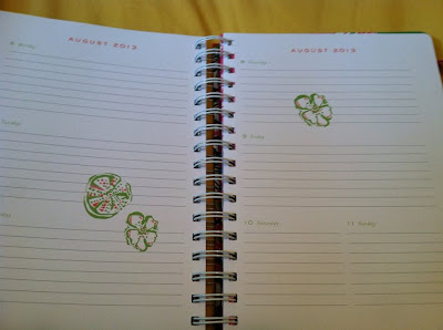
And following that is the more detailed, day views. I love that each day has a lot of lines to write down assignments and due dates. One thing I wish they incorporated was a box for notes. So instead I usually just post a sticky note on the right side of the right page and right down my to-do lists there. Of course my sticky notes are Vera Bradley because they have to be cute!
So that is the conclusion to the tour of the agenda. I think it's a great investment for the money and something I'd recommend all college students to have. Plus the designs always brighten my day too.
And like I promised, below are all the month designs! There are some really cute ones this year! Which month is your favorite? Personally I love the September with the foxes!


This comment has been removed by the author.
ReplyDelete